This is a series of articles about creating a color picker in SwiftUI. The current value of the color picker we’re creating in this series will be displayed as follows.
- Display labels and values above the gradient view
- Values can be edited from the keyboard
- Display a cursor indicating the current value on the gradient view
Let’s add a display of the current value for each channel. We want to display the current value as a string and allow the user to enter a value from the keyboard so that we will use a text field. We will create a label for this text field and the channel name in this case.
Implement a model
The current value is a floating point number from 0.0 to 1.0. Next, implement a model class with properties to contain the values of each channel; since it will be used in combination with SwiftUI, it should be a conforming class for the ObservableObject protocol.
import SwiftUI

class ColorPickerChannelValue : ObservableObject {
    @Published var red: Double = 0.0
    @Published var green: Double = 0.0
    @Published var blue: Double = 0.0
}
Add a value to the ColorPicker view
The main source of data, the value of each channel, is in the ColorPicker view. Therefore, the ColorPickerChannelValue should be generated and destroyed by the ColorPicker.
struct ColorPicker: View {
    var redStartColor: Color = Color(red: 0.0, green: 0.0, blue: 0.0)
    var redEndColor: Color = Color(red: 1.0, green: 0.0, blue: 0.0)

    var greenStartColor: Color = Color(red: 0.0, green: 0.0, blue: 0.0)
    var greenEndColor: Color = Color(red: 0.0, green: 1.0, blue: 0.0)

    var blueStartColor: Color = Color(red: 0.0, green: 0.0, blue: 0.0)
    var blueEndColor: Color = Color(red: 0.0, green: 0.0, blue: 1.0)

    @StateObject var channelValue = ColorPickerChannelValue()

// 省略
Create bindings for text fields
TextField can display and edit values, so we pass a Binding<String>. At first glance, it seems like you could pass $ColorPickerChannelValue.red, etc., but since ColorPickerChannelValue is a Double, $ColorPickerChannelValue.red would be Binding<Double>.
So, create the property to be Binding<String> as follows.
import SwiftUI

class ColorPickerChannelValue : ObservableObject {
    @Published var red: Double = 0.0
    @Published var green: Double = 0.0
    @Published var blue: Double = 0.0

    var redDisplayString: Binding<String> { Binding(
        get: { String(format: "%g", self.red) },
        set: { if let value = Double($0) {
            self.red = value
        }}
    )}

    var greenDisplayString: Binding<String> { Binding(
        get: { String(format: "%g", self.green) },
        set: { if let value = Double($0) {
            self.green = value
        }}
    )}

    var blueDisplayString: Binding<String> { Binding(
        get: { String(format: "%g", self.blue) },
        set: { if let value = Double($0) {
            self.blue = value
        }}
    )}
}
Create bindings with computed properties
When the type of value to be managed and the type of binding does not match, as in this case, it may be easier to create a Computed Property for the binding. When creating bindings with Computed Property, you can use an initializer to write a closure for setting and retrieving values, as shown below.
init(get: @escaping () -> Value, set: @escaping (Value) -> Void)
Allow decimal places to be entered (added September 19, 2022)
The implemented Computed Property is acceptable as a string to be displayed on the label, but when I try to edit it in a text field, I encounter a bug that prevents me from entering decimal places.
The cause is that when it cannot be converted to Double, it reverts to the string in its pre-edit state (the display does not revert, but internally), so for example, if you try to enter 0.1 in the field for the red channel, the behavior is as follows.
- When you enter up to
0.,0is assigned to red. (This is OK) getof theredDisplayStringproperty is called, and the string0.0is returned. (This is NG)- The field string would be
0.0.
To maintain the ability to enter decimal places, we must ensure the string 0. can be preserved.
To do so, change the implementation of redDisplayString, greenDisplayString, and blueDisplayString so that the process is as follows.
- Create properties that hold the strings being input as a string.
- The getter of property returns a property of 1.
- The property setter updates the value only when it can be converted to `Double`. At the same time, a string is assigned to the property 1, regardless of whether it can be converted or not.
The code would look something like this.
import SwiftUI
class ColorPickerChannelValue : ObservableObject {
@Published var red: Double = 0.0
@Published var green: Double = 0.0
@Published var blue: Double = 0.0
private var redEnteredString: String?
private var greenEnteredString: String?
private var blueEnteredString: String?
var redDisplayString: Binding<String> { Binding(
get: {
self.redEnteredString ?? String(format: "%g", self.red)
},
set: {
self.redEnteredString = $0
if let value = Double($0) {
self.red = value
}
}
)}
var greenDisplayString: Binding<String> { Binding(
get: {
self.greenEnteredString ?? String(format: "%g", self.green)
},
set: {
self.greenEnteredString = $0
if let value = Double($0) {
self.green = value
}
}
)}
var blueDisplayString: Binding<String> { Binding(
get: {
self.blueEnteredString ?? String(format: "%g", self.blue)
},
set: {
self.blueEnteredString = $0
if let value = Double($0) {
self.blue = value
}
}
)}
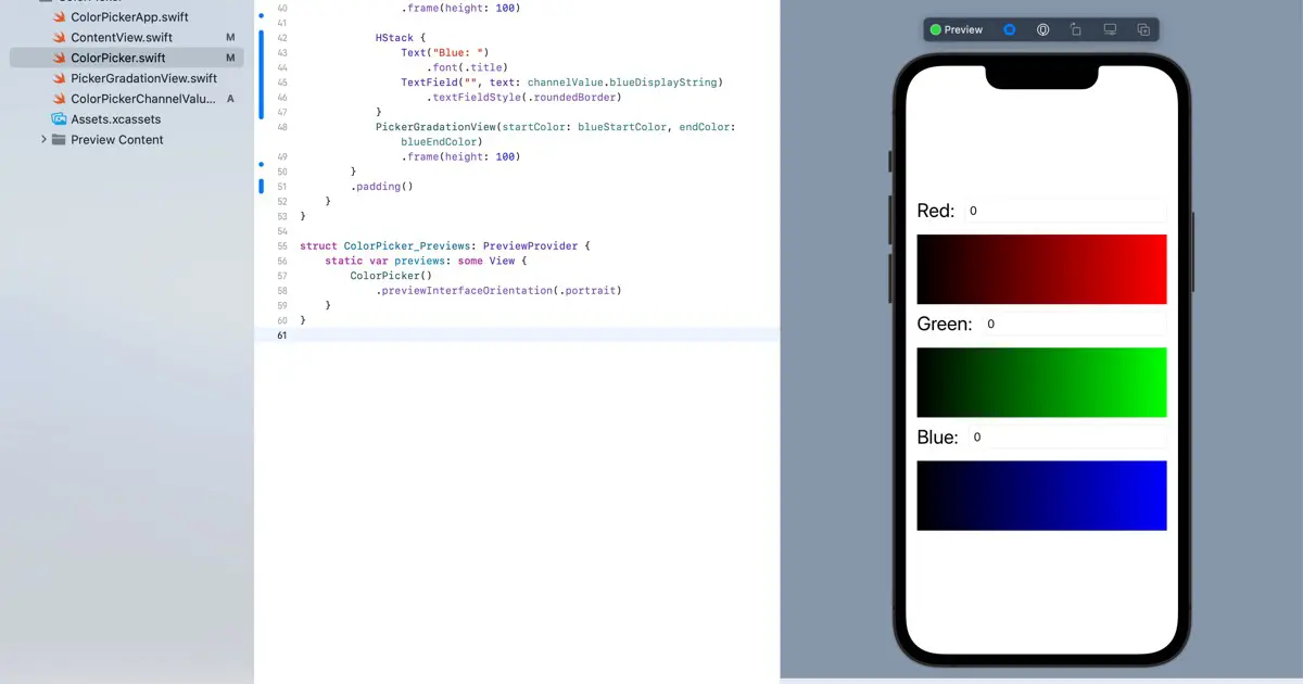
}Create labels and text fields
Create labels and text fields. Then, arrange the following two horizontally for each channel.
- Label
- Text field
The code would look like this.
HStack {
    Text("Red: ")
        .font(.title)
    TextField("", text: channelValue.redDisplayString)
        .textFieldStyle(.roundedBorder)
}
Create other channels too, the code would look like this.
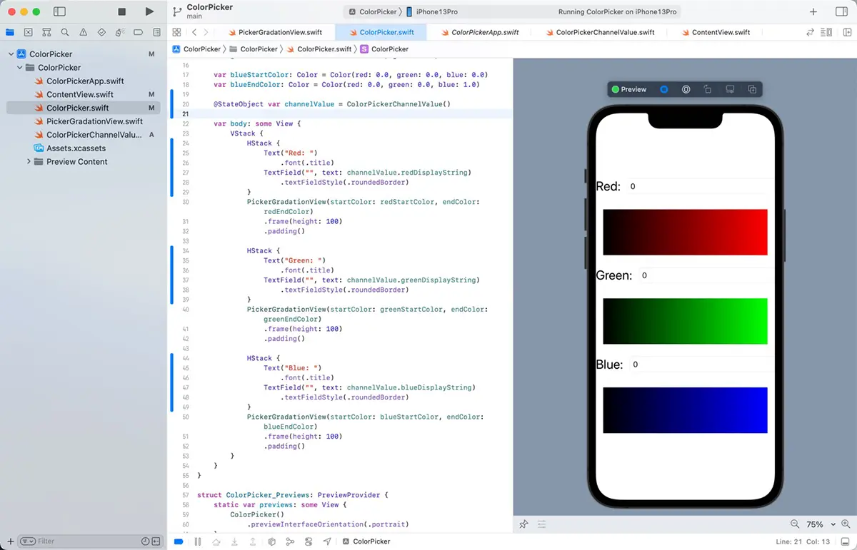
var body: some View {
    VStack {
        HStack {
            Text("Red: ")
                .font(.title)
            TextField("", text: channelValue.redDisplayString)
                .textFieldStyle(.roundedBorder)
        }
        PickerGradationView(startColor: redStartColor, endColor: redEndColor)
            .frame(height: 100)
            .padding()

        HStack {
            Text("Green: ")
                .font(.title)
            TextField("", text: channelValue.greenDisplayString)
                .textFieldStyle(.roundedBorder)
        }
        PickerGradationView(startColor: greenStartColor, endColor: greenEndColor)
            .frame(height: 100)
            .padding()

        HStack {
            Text("Blue: ")
                .font(.title)
            TextField("", text: channelValue.blueDisplayString)
                .textFieldStyle(.roundedBorder)
        }
        PickerGradationView(startColor: blueStartColor, endColor: blueEndColor)
            .frame(height: 100)
            .padding()
    }
}
If you examine the preview in this state, you’ll notice that it requires more balance.
Adjust the balance
Adjust the balance. Add margins to the label’s left edge and the text field’s right edge, as there are no margins. It seems better to add padding to the VStack, which contains these items than to put it in each label. But, then, the padding in the PickerGradationView would be excessive, so that we would remove these.
import SwiftUI

struct ColorPicker: View {
    var redStartColor: Color = Color(red: 0.0, green: 0.0, blue: 0.0)
    var redEndColor: Color = Color(red: 1.0, green: 0.0, blue: 0.0)

    var greenStartColor: Color = Color(red: 0.0, green: 0.0, blue: 0.0)
    var greenEndColor: Color = Color(red: 0.0, green: 1.0, blue: 0.0)

    var blueStartColor: Color = Color(red: 0.0, green: 0.0, blue: 0.0)
    var blueEndColor: Color = Color(red: 0.0, green: 0.0, blue: 1.0)

    @StateObject var channelValue = ColorPickerChannelValue()

    var body: some View {
        VStack {
            HStack {
                Text("Red: ")
                    .font(.title)
                TextField("", text: channelValue.redDisplayString)
                    .textFieldStyle(.roundedBorder)
            }
            PickerGradationView(startColor: redStartColor, endColor: redEndColor)
                .frame(height: 100)

            HStack {
                Text("Green: ")
                    .font(.title)
                TextField("", text: channelValue.greenDisplayString)
                    .textFieldStyle(.roundedBorder)
            }
            PickerGradationView(startColor: greenStartColor, endColor: greenEndColor)
                .frame(height: 100)

            HStack {
                Text("Blue: ")
                    .font(.title)
                TextField("", text: channelValue.blueDisplayString)
                    .textFieldStyle(.roundedBorder)
            }
            PickerGradationView(startColor: blueStartColor, endColor: blueEndColor)
                .frame(height: 100)
        }
        .padding()
    }
}
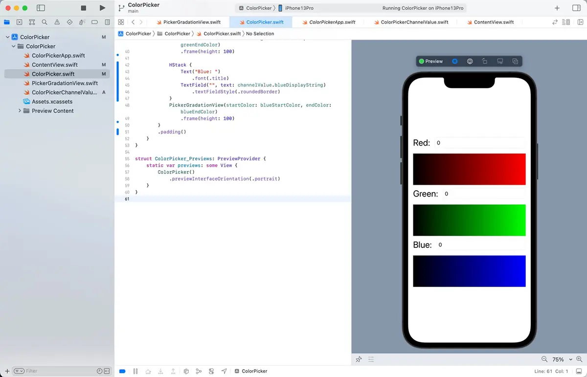
Before creating the labels, I thought removing the padding on the PickerGradationView would result in too much space between the top and bottom. Still, the labels and text field made it just right.