This is a series of articles on creating a color picker in SwiftUI. We created a text field in the previous article to display the current value. In this article, we will continue the process by implementing the look and feel of the process to display a knob indicating the current value on the gradient view.
For the knob’s shape in this article, we intend to use the following design.
- Black borders on white circles.
- The X coordinate is placed so that the circle’s center is at the current value’s position, with the left end at
0.0and the right end at1.0. - The Y coordinate should be centered at the height of the gradient view.
Drawing a circle in SwiftUI
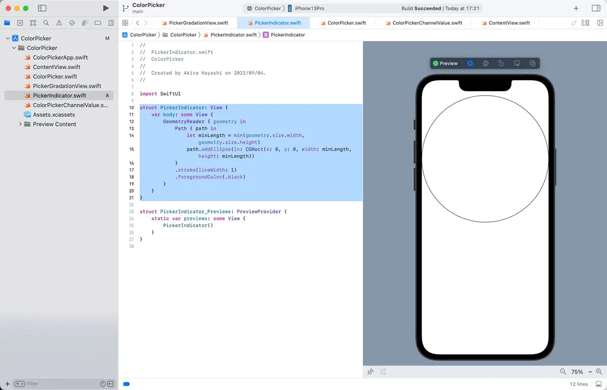
In SwiftUI, you can draw a circle by combining GeometryReader and Path. For example, the following code.
struct PickerIndicator: View {
    var body: some View {
        GeometryReader { geometry in
            Path { path in
                let minLength = min(geometry.size.width, geometry.size.height)
                path.addEllipse(in: CGRect(x: 0, y: 0, width: minLength, height: minLength))
            }
            .stroke(lineWidth: 1)
            .foregroundColor(.black)
        }
    }
}
When you run this code, the following output will be produced.
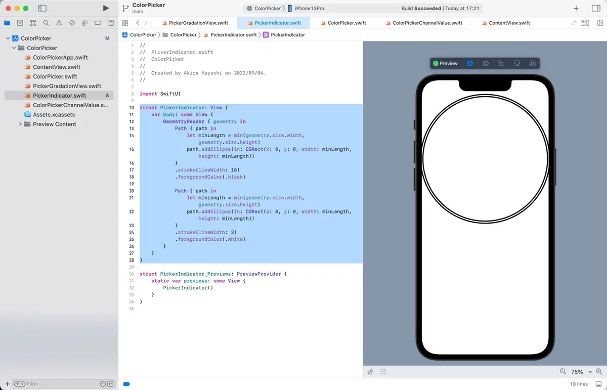
The following process can implement a white circle with a black border.
- Draw a thicker black circle.
- Draw a white circle with a thin line on top.
In SwiftUI, this can be achieved with the following code.
struct PickerIndicator: View {
    var body: some View {
        GeometryReader { geometry in
            Path { path in
                let minLength = min(geometry.size.width, geometry.size.height)
                path.addEllipse(in: CGRect(x: 0, y: 0, width: minLength, height: minLength))
            }
            .stroke(lineWidth: 10)
            .foregroundColor(.black)

            Path { path in
                let minLength = min(geometry.size.width, geometry.size.height)
                path.addEllipse(in: CGRect(x: 0, y: 0, width: minLength, height: minLength))
            }
            .stroke(lineWidth: 3)
            .foregroundColor(.white)
        }
    }
}
When you run this code, you will see the following.
Draw indicator on gradient view
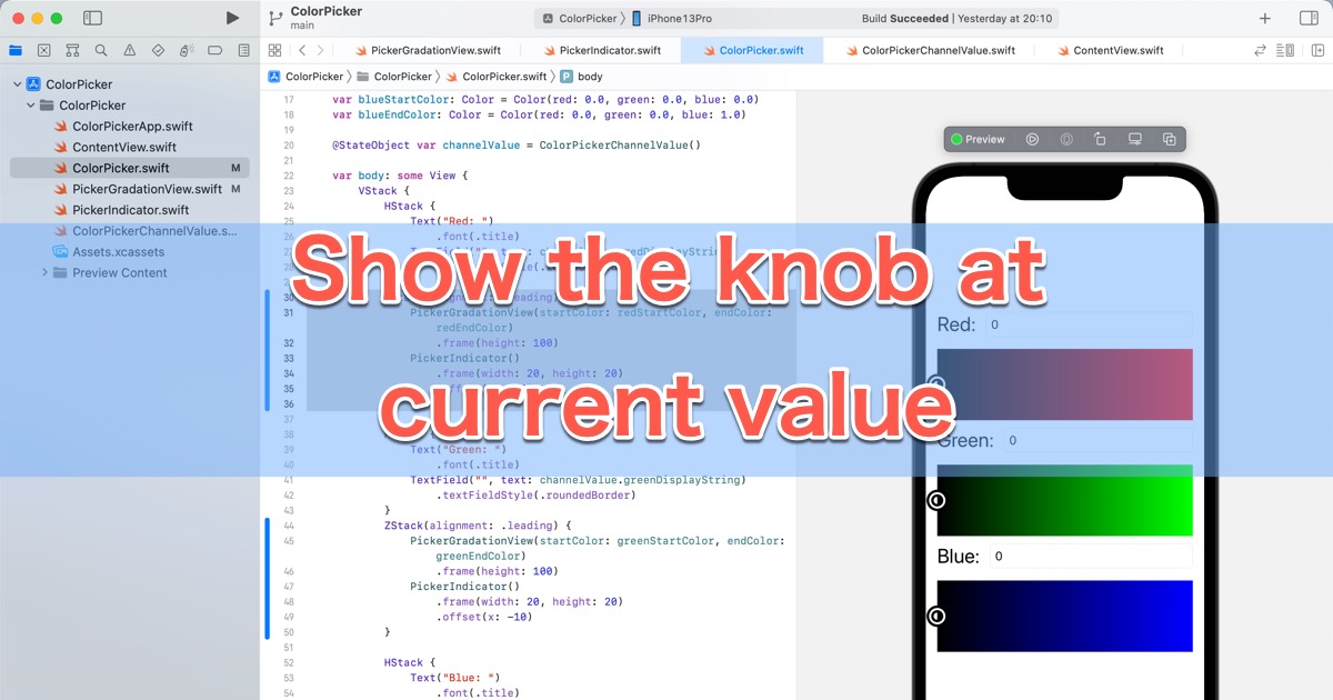
We will now draw an indicator on the gradient view for each channel. Then, based on the code in “Drawing a circle in SwiftUI”, we will implement the indicator draws.
Add a PickerIndicator to the ColorPicker view
Add a PickerIndicator view and use the code described in “Drawing Circles in SwiftUI”.
With that in place, add the following code to the ColorPicker to display a PickerIndicator in each channel’s center of the gradient view. The code will look something like this.
struct ColorPicker: View {
    var redStartColor: Color = Color(red: 0.0, green: 0.0, blue: 0.0)
    var redEndColor: Color = Color(red: 1.0, green: 0.0, blue: 0.0)

    var greenStartColor: Color = Color(red: 0.0, green: 0.0, blue: 0.0)
    var greenEndColor: Color = Color(red: 0.0, green: 1.0, blue: 0.0)

    var blueStartColor: Color = Color(red: 0.0, green: 0.0, blue: 0.0)
    var blueEndColor: Color = Color(red: 0.0, green: 0.0, blue: 1.0)

    @StateObject var channelValue = ColorPickerChannelValue()

    var body: some View {
        VStack {
            HStack {
                Text("Red: ")
                    .font(.title)
                TextField("", text: channelValue.redDisplayString)
                    .textFieldStyle(.roundedBorder)
            }
            ZStack(alignment: .leading) {
                PickerGradationView(startColor: redStartColor, endColor: redEndColor)
                    .frame(height: 100)
                PickerIndicator()
                    .frame(width: 20, height: 20)
            }

            HStack {
                Text("Green: ")
                    .font(.title)
                TextField("", text: channelValue.greenDisplayString)
                    .textFieldStyle(.roundedBorder)
            }
            ZStack(alignment: .leading) {
                PickerGradationView(startColor: greenStartColor, endColor: greenEndColor)
                    .frame(height: 100)
                PickerIndicator()
                    .frame(width: 20, height: 20)
            }

            HStack {
                Text("Blue: ")
                    .font(.title)
                TextField("", text: channelValue.blueDisplayString)
                    .textFieldStyle(.roundedBorder)
            }
            ZStack(alignment: .leading) {
                PickerGradationView(startColor: blueStartColor, endColor: blueEndColor)
                    .frame(height: 100)
                PickerIndicator()
                    .frame(width: 20, height: 20)
            }
        }
        .padding()
    }
}
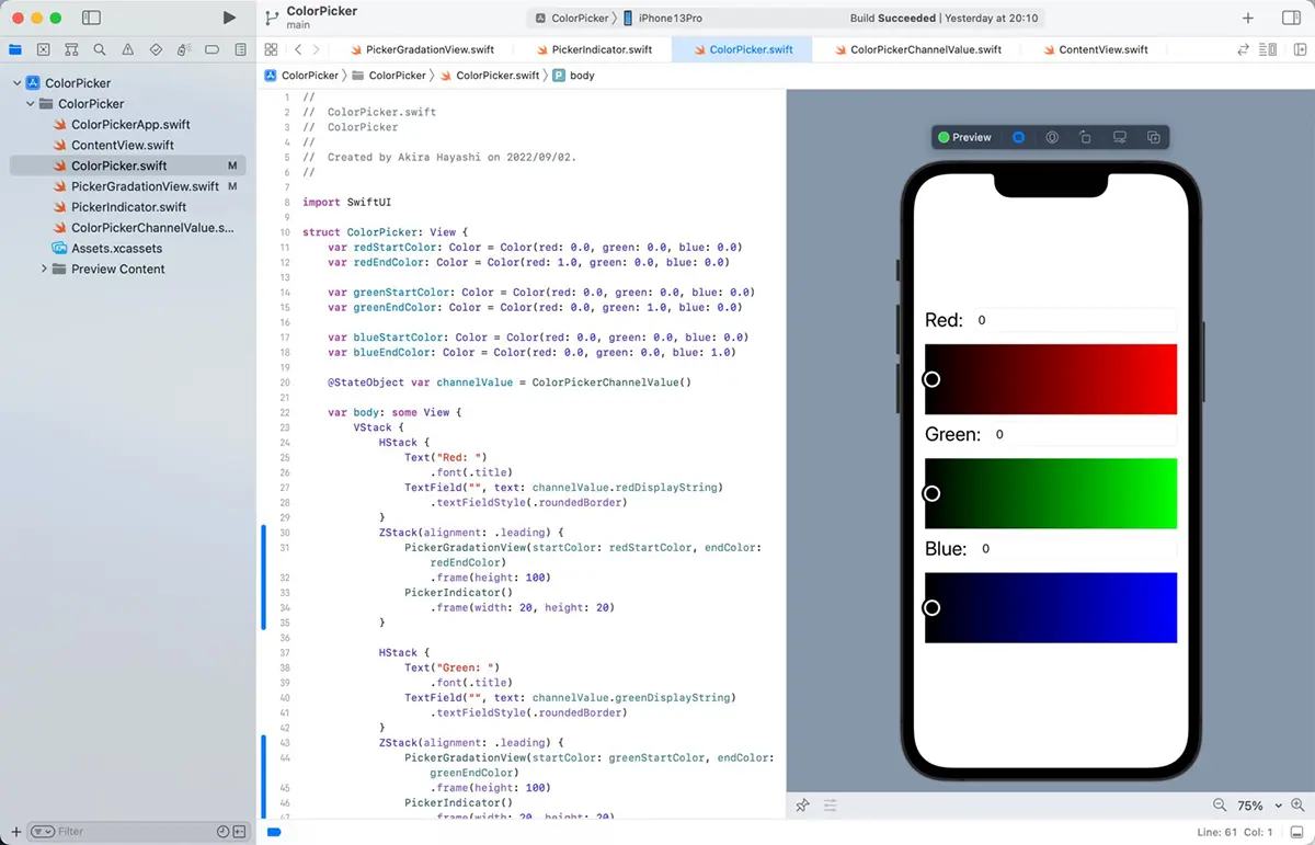
As the PickerIndicator view overlays the PickerGradationView, the PickerGradationView has been moved into the ZStack.
The PickerIndicator view is too large in its default state, so it is resized to just the right size using the frame modifier.
ZStack is centered by default. We changed the alignment to left-aligned (leading) by specifying .leading as the argument alignment.
When you run this code, you will see the following.
Adjust the zero position of the PickerIndicator
Look closely at the preview; you will see that the PickerIndicator is slightly off to the right.
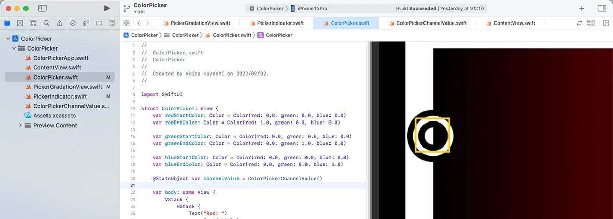
Add the code below from “// Draw a bounding box” to the PickerIndicator. It draws a bounding box of the GeometryReader.
struct PickerIndicator: View {
    var body: some View {
        GeometryReader { geometry in
            Path { path in
                let minLength = min(geometry.size.width, geometry.size.height)
                path.addEllipse(in: CGRect(x: 0, y: 0, width: minLength, height: minLength))
            }
            .stroke(lineWidth: 10)
            .foregroundColor(.black)

            Path { path in
                let minLength = min(geometry.size.width, geometry.size.height)
                path.addEllipse(in: CGRect(x: 0, y: 0, width: minLength, height: minLength))
            }
            .stroke(lineWidth: 3)
            .foregroundColor(.white)

            // Draw a bounding box
            Path { path in
                path.move(to: CGPoint(x: 0, y: 0))
                path.addLine(to: CGPoint(x: geometry.size.width - 1, y: 0))
                path.addLine(to: CGPoint(x: geometry.size.width - 1, y: geometry.size.height - 1))
                path.addLine(to: CGPoint(x: 0, y: geometry.size.height - 1))
                path.addLine(to: CGPoint(x: 0, y: 0))
            }
            .stroke(lineWidth: 1)
            .foregroundColor(.yellow)
        }
    }
}
You can see that the left edge of the bounding box is the alignment position by ZStack.
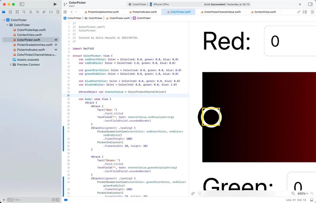
When the PickerIndicator has a value of 0 and is on the left edge, the center of the PickerIndicator must be on the left edge of the PickerGradationView. To do so, the PickerIndicator must be shifted to the left by half of its width.
The offset modifier can be used to adjust the position. For example, add the offset modifier to PickerIndicator().
ZStack(alignment: .leading) {
	PickerGradationView(startColor: redStartColor, endColor: redEndColor)
		.frame(height: 100)
	PickerIndicator()
		.frame(width: 20, height: 20)
		.offset(x: -10)
}
Upon running this code, the correct position will be displayed as follows. Also, please remove the bounding box drawing code you added to the PickerIndicator, as it is no longer needed.