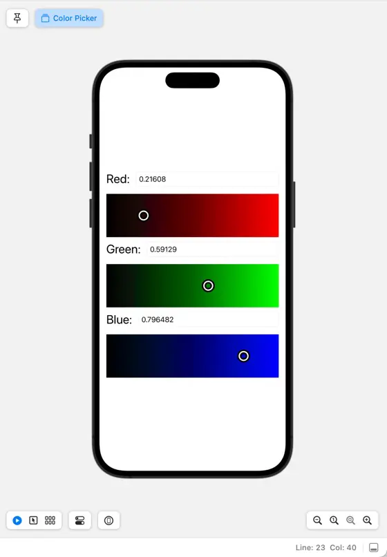
This is a series of articles on creating a color picker in SwiftUI. In this article, we’ll implement a color preview, drawing upon the values selected using the RGB channel sliders we built in the previous articles.
Moreover, we need to ensure greater accuracy when specifying numeric values, as the current value format is limited to one decimal place. The format for stringification should also be corrected.
Change format of current value into string
Let’s alter the filedText property of the ColorPickerChannelModel class, transitioning the string formatting from %.1f to %g as shown below.
    /// 入力中のテキストのバインディング
    var fieldText: Binding<String> {
        Binding {
            self.fieldTextStore ?? String(format: "%g", self.currentValue)
        } set: {
            self.fieldTextStore = $0
            if let value = Double($0) {
                self.changeCurrentValue(value)
            }
        }
    }
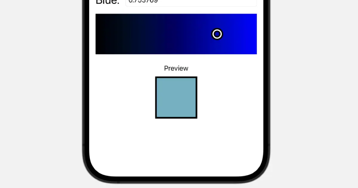
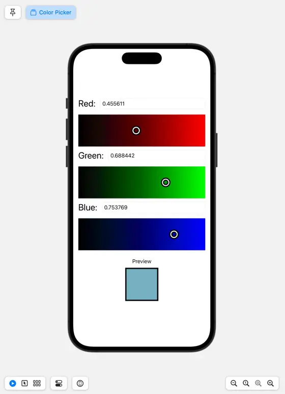
Show color preview
Let’s set about implementing the procedure to display a preview of the chosen color.
Implement ColorPickerPreview
We will design a view to showcase the preview, which should be handled as follows.
- Fill with the selected color
- Attach a frame of about 4 pixels
The code would look something like this.
import SwiftUI
struct ColorPickerPreview: View {
@Binding var color: Color
var body: some View {
GeometryReader { geometry in
Path { path in
path.addRect(CGRect(x: 0, y: 0, width: geometry.size.width, height: geometry.size.height))
}
.fill(color)
Path { path in
path.addRect(CGRect(x: 0, y: 0, width: geometry.size.width, height: geometry.size.height))
}
.stroke(lineWidth: 4)
}
}
}
struct ColorPickerPreview_Previews: PreviewProvider {
static var previews: some View {
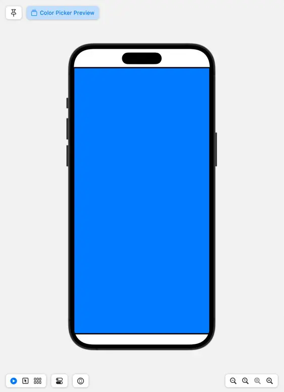
ColorPickerPreview(color: .constant(.blue))
}
}
Add to ColorPicker
Let’s situate the ColorPickerPreview within the ColorPicker, positioning it beneath the three `PickerGradationView` with dimensions set around 50 pixels for both height and width.
Create a binding to pass to the ColorPickerPreview.color property. Create a Color from redChannel.currentValue, greenChannel.currentValue, and blueChannel.currentValue, and add the properties to be returned by the Binding.
    var color: Binding<Color> {
        Binding {
            Color(red: redChannel.currentValue,
                  green: greenChannel.currentValue,
                  blue: blueChannel.currentValue)
        } set: { _ in
        }

    }
Place the ColorPickerPreview in the view. Place the padding and labels together for clarity.
import SwiftUI

struct ColorPicker: View {
    @StateObject var redChannel: ColorPickerChannelModel = ColorPickerChannelModel(channelName: "Red")
    @StateObject var redGradation: ColorPickerGradationModel = .red

    @StateObject var greenChannel: ColorPickerChannelModel = ColorPickerChannelModel(channelName: "Green")
    @StateObject var greenGradation: ColorPickerGradationModel = .green

    @StateObject var blueChannel: ColorPickerChannelModel = ColorPickerChannelModel(channelName: "Blue")
    @StateObject var blueGradation: ColorPickerGradationModel = .blue

    var color: Binding<Color> {
        Binding {
            Color(red: redChannel.currentValue,
                  green: greenChannel.currentValue,
                  blue: blueChannel.currentValue)
        } set: { _ in
        }

    }

    var body: some View {
        VStack {
            ColorPickerSubView(channel: redChannel, gradation: redGradation)
            ColorPickerSubView(channel: greenChannel, gradation: greenGradation)
            ColorPickerSubView(channel: blueChannel, gradation: blueGradation)
            VStack {
                Text("Preview")
                ColorPickerPreview(color: color)
                    .frame(width: 100, height: 100)
            }
            .padding()
        }
        .padding()
    }
}

struct ColorPicker_Previews: PreviewProvider {
    static var previews: some View {
        ColorPicker()
            .previewInterfaceOrientation(.portrait)
    }
}
Download the code
Click here to download the code created for this article.