We are attempting to re-implement MultiTextConverter in Swift. This time, continuing with the creation of the look and feel of the preferences window, we are adjusting the layout of the conversion tab.
For background information, please refer to this article.

Adjustment details
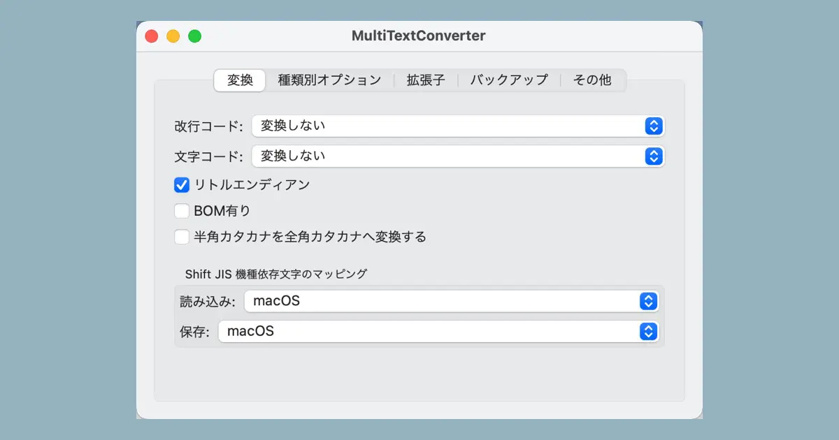
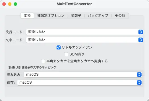
We created a conversion tab in the Preferences window in a previous article. However, the layout needed to be adjusted. The status at this time is as follows.
This article will detail the following adjustments.
- Overall margins are small, so create margins on the left and right.
- Vertically centered, so bring it to the top edge.
- Checkboxes are centered, so make it to be left aligned.
Create margins on the left and right
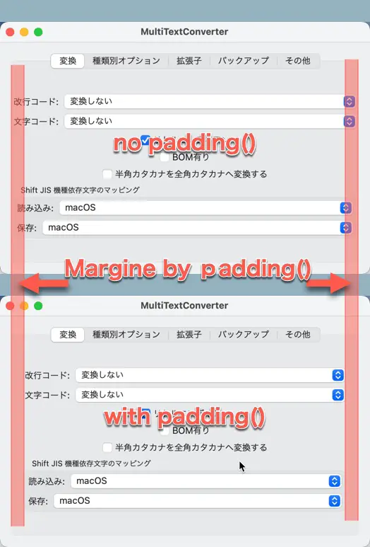
I’ve noticed that the tab borders and popup button borders are too close together; to create a margin around the view in SwiftUI, use the padding() modifier.
The content of the conversion tab is implemented in ConverterOptionView, which has an outermost VStack, and all the popup buttons are in this VStack.
In other words, we need to create a margin around the VStack to provide space between the border of the tab and the popup button.
The code is as follows.
struct ConverterOptionView: View {
    var body: some View {
        VStack {

        }
        .padding()
    }
}
The figure below compares the layout before and after applying the padding() modifier. padding() adds a good margin.
Align with the vertical top edge
Next, we adjust the vertical alignment of the whole. The entire layout is contained within a VStack, which aligns its subviews vertically; since the VStack is vertically centered, we’re going to add an expandable spacer at the end of the VStack‘s subviews to align them with the top edge.
Expandable spacers are Spacer() in SwiftUI.
Add Spacer() at the end of the VStack subview after GroupBox.
struct ConverterOptionView: View {
    var body: some View {
        VStack {
            // ...

            GroupBox("Shift JIS 機種依存文字のマッピング") {
                Picker("読み込み:", selection: $sjisMappingRead) {
                    Text("macOS").tag(0)
                    Text("Windows (Code Page 932)").tag(1)
                }

                Picker("保存:", selection: $sjisMappingWrite) {
                    Text("macOS").tag(0)
                    Text("Windows (Code Page 932)").tag(1)
                }
            }

            Spacer()
        }
        .padding()
    }
}
Left-align checkboxes, etc.
The popup buttons and group boxes are resized to fit the size of the tab view, so there is no problem, but the checkboxes are not resized and are centered. This doesn’t look right, so let’s align them to the left instead.
The horizontal alignment of the subviews in the VStack can be specified to the argument of the VStack initializer.
With the following code, the subviews of the VStack are aligned left (leading).
VStack(alignment: .leading)Create the margin between the checkbox and the group box
At this point, we ran it and got the following window.
I got the impression that the checkbox and the label were too close.
It’s fine to create a bit more margin. We add the Spacer() and specify its height. To set the size, we use frame() modifier.
struct ConverterOptionView: View {

    var body: some View {
        VStack(alignment: .leading) {
            // ...

            Toggle("半角カタカナを全角カタカナへ変換する", isOn: $replaceHalfKatakana)

            Spacer()
                .frame(height: 20)

            GroupBox("Shift JIS 機種依存文字のマッピング") {
                // ...
            }

            Spacer()
        }
        .padding()
    }
}
Conclusion
I’ve completed the layout for the conversion tab. At this point, it should look like this.
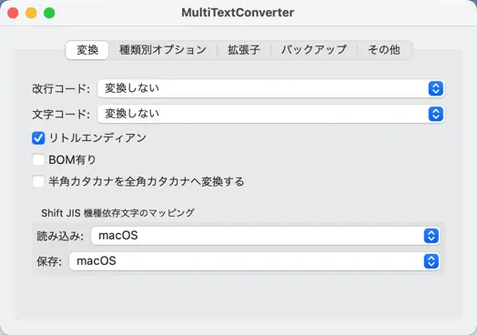
Resize the window, and the layout is adjusted as expected.
Can the Flutter Desktop develop the MultiTextConverter?
MultiTextConverter has no specific device-dependent features. That would be easy to implement in a framework that can support multiple platforms, such as Flutter. Flutter, for example, now supports desktop apps for macOS starting with 3.0.
I’ve begun the build with SwiftUI, but I’m also interested in exploring Flutter Desktop.
I will interrupt for a while to study and review Flutter.